Layering CSS so we can use flexbox now

We can start using flexbox right now while still having a similar layout in older browsers by taking advantage of the "cascading" part of cascading style sheets. In this article I'm going to explain how we can take advantage of some of the similarities between flexbox and inline-block layouts to achieve a progressively enhanced layout that looks good in all browsers.
#How it works under the hood
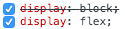
When you specify multiple variations of the same property e.g.
.class {
    display: block;
    display: flex;
}
The browser that parses this CSS file will use the last defined property that it understands. In this case, a browser that supports display: flex will use it, and disregard display: block. On the other hand, a browser that does not understand display: flex will use the display: block property and completely ignore display: flex
This is what is happening when you see crossed out declarations in web inspector like this:
This is exactly the behaviour that allows us to specify multiple vendor prefixes and not break anything - the browsers will only use those properties that they understand and ignore those that they don't understand.
.class {
    display: -ms-flexbox;
    display: -webkit-flex;
    display: flex;
}
With a bit of creativity, you can use this to your advantage and start to use newer css properties by enhancing a robust, established, older css property with a more modern one that does roughly the same thing.
#Enhance inline-block layouts with flexbox
A good example of this process is to enhance an inline-block layout with flexbox properties so that we can take advantage of modern layout techniques while having a reliable fallback for older browsers.
I don't think we need to worry about Modernizr or feature detection of any kind for this layout because we're progressively enhancing rather than providing two separate layout solutions. We can be confident that older browsers will be able to handle the inline-block layout and accept that it won't look quite as good as the flexbox layout.
Please note that I've added a few basic styles to these demos to enhance visual clarity.
#inline-block layout
This is a basic inline-block layout which works in pretty much all known browsers. It's a good, robust, place to start.
- one
- two
- three
- four
.block {
    display: block;
}

.block__item {
    display: inline-block;
    min-width: 10%;
}
<ul class="block">
    <li class="block__item">one</li>
    <li class="block__item">two</li>
    <li class="block__item">three</li>
    <li class="block__item">four</li>
</ul>
#flex layout
This gives us effectively the same layout as the inline-block one but it uses flexbox.
- one
- two
- three
- four
.flex {
    display: flex;
    flex-wrap: wrap;
}

.flex__item {
    min-width: 10%;
}
<ul class="flex">
    <li class="flex__item">one</li>
    <li class="flex__item">two</li>
    <li class="flex__item">three</li>
    <li class="flex__item">four</li>
</ul>
#flex and inline-block combined
This is a combination of the inline-block and flexbox layouts. We know that if a browser doesn't support flexbox that we'll still get the layout we want because that browser will ignore the flexbox properties and use the inline-block ones that it does understand.
- one
- two
- three
- four
.flexblock-basic {
    display: block;
    display: flex;
    flex-wrap: wrap;
}

.flexblock-basic__item {
    display: inline-block;
    min-width: 10%;
}
<ul class="flexblock-basic">
    <li class="flexblock-basic__item">one</li>
    <li class="flexblock-basic__item">two</li>
    <li class="flexblock-basic__item">three</li>
    <li class="flexblock-basic__item">four</li>
</ul>
#flex and inline-block combined (with vendor prefixes)
The logical next step from here is to add our vendor prefixes to cover more browsers. Now our flexbox layout will work in more browsers too.
- one
- two
- three
- four
.flexblock {
    display: block;
    display: -ms-flexbox;
    display: -webkit-flex;
    display: flex;
    -ms-flex-wrap: wrap;
    -webkit-flex-wrap: wrap;
    flex-wrap: wrap;
}

.flexblock__item {
    display: inline-block;
    min-width: 10%;
}
<ul class="flexblock">
    <li class="flexblock-basic__item">one</li>
    <li class="flexblock-basic__item">two</li>
    <li class="flexblock-basic__item">three</li>
    <li class="flexblock-basic__item">four</li>
</ul>
#Further enhancements
We can go even further with this. The reason flexbox is so useful is because it has all sorts of properties that can affect horizontal and vertical alignment. Inline-block also has some properties available that do roughly the same things (with varying degress of success) so we can stack these up too.
In an inline-block layout text-align: center gives us roughly the same result as justify-content: center in a flexbox layout while vertical-align: middle in an inline-block layout is roughly the same as using align-items: center in a flexbox layout.
So let's apply both of these to modifier classes and let the browsers decide which ones they understand.
-
one
-
two
-
three
- four
.flexblock--center-h {
    text-align: center;
    justify-content: center;
}

.flexblock--center-v {
      vertical-align: middle;
    -ms-flex-align: center;
    -webkit-align-items: center;
    align-items: center;
}
<ul class="flexblock flexblock--center-h flexblock--center-v">
    <li class="flexblock__item"><h1>one</h1></li>
    <li class="flexblock__item"><p>two</p></li>
    <li class="flexblock__item"><h2>three</h2></li>
    <li class="flexblock__item">four</li>
</ul>
This layout looks roughly the same in almost any browser you care to try it in because we've got a solid, old fashioned layout solution with the more modern flexbox solution layered on top.
We can do something similiar with text-align: justify and justify-content: space-between to again give us roughly the same layout in all browsers:
-
one
-
two
-
three
- four
.flexblock--justify {
    text-align: justify;
    -moz-text-align-last: justify;
    text-align-last: justify;
    -ms-flex-pack: justify;
    -webkit-justify-content: space-between;
    justify-content: space-between;
}
<ul class="flexblock flexblock--justify">
    <li class="flexblock__item"><h1>one</h1></li>
    <li class="flexblock__item"><p>two</p></li>
    <li class="flexblock__item"><h2>three</h2></li>
    <li class="flexblock__item">four</li>
</ul>
There are some things that the inline-block layout still can't do such as same height blocks but now we've established a solid baseline for our layout, we could begin to take advantage of more flexbox properties and enhance it further safe in the knowledge that even the oldest browsers will still render the basic layout.
Here's a page with all these examples on it so feel free to test this out yourself in older browsers or via browserstack or just take a look at these screenshots:
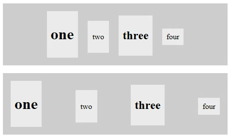
#With flexbox support
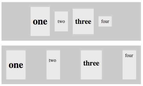
#Without flexbox support
So there you have it. We can experiment with all sorts of CSS properties in this way and have browsers take advantage of the properties that they support.
#A more fully featured example
I've used this technique to build reflex, a lightweight responsive flexbox grid with cross browser support, an inline-block fallback and no polyfills so please take a look at the documentation for further examples.
#Further reading
Chris Wright's article about using flexbox goes into a lot of detail on how to enhance float layouts with flexbox.